


Intro
How does our selected collection relate to our own lived experience(s)?
Our selected archival collection not only serves as a window into industrial history but also resonates deeply with our contemporary experiences of how data is presented, hidden, or manipulated in modern society.
Our research began with a critical analysis of historical documents, specifically accident reports from the General Register. While these records ostensibly complied with the Factories and Workshops Act of 1901, we quickly noticed some glaring omissions. For example, reports only included superficial information such as the date of the accident, job title, and severity of the injury, but consistently left out crucial follow-up details such as rehabilitation outcomes, compensation, or dismissal. This prompted us to question the purpose of this data: was it really intended to protect workers, or was it simply a matter of bureaucratic compliance?
This critical inquiry led us to a particularly striking case: that of Ernest Gill. This child was recorded as having started working in a factory just six days after his second birthday. While the document does not detail the content of his work, its very existence highlights the normalisation of exploitative labour practices at the time and the lack of ethical scrutiny in the data. The lack of commentary or context in these records highlights the role that archives play in legitimising what is recorded and equally erasing what is not recorded.
It’s important to be aware that these issues are not distant or historical. They echo challenges we still face today. As more people engage with digital platforms, data-driven policies, and international reporting, we are increasingly aware of how data is collated, filtered, and often politicized. Our own experiences of browsing online information, whether it’s government reports, NGO campaigns, or media narratives, have led us to wonder: Is data on child labour more transparent today than it was a century ago?
This question became the core of our project.
From Ernest Gill’s missing data to the missing metadata of the informal sector in Bangladesh, India, and China, we began to trace patterns of selective data disclosure. As Roberts (2018) points out, modern archives—digital or otherwise—remain vulnerable to manipulation, often influenced by economic and political interests. As a result, we mistrust embellished narratives. Our own experiences of confronting algorithmic filtering and questioning the integrity of “official” reports allowed us to resonate with these historical archives on a personal level.
So, historical archives become a mirror for contemporary issues. Our research is not just about comparing “then” and “now”, but about recognizing the continuity of data control across different timescales and how this control determines whose stories are told and whose stories are left aside.
Contextual Literature Review
Child labour and the hidden data surrounding it have long been a troubling aspect of global industrial development. While it is often viewed as a problem of the past in modern civilized societies, it continues to affect millions of children around the world today (UNICEF, 2024). This literature review will explore how child labour is represented in historical records and contemporary datasets, with a focus on how archives reflect wider power structures and hidden data. Drawing on scholarship on archives and data, this review explores how selective preservation, omissions, and manipulation of data affect historical and contemporary understandings of child labour.
First, to critically evaluate historical and contemporary records of child labour, it is necessary to understand the political and philosophical frameworks that underpin archives. Derrida and Prenowitz (1995) traces the word archive to the Greek word ‘arkhe’, which denotes both origin and authority. From this, archives cannot be simply viewed as neutral repositories of facts. Instead, we should be more vigilant about the information conveyed by archives and understand them as tools to strengthen legitimacy, construct memory, and regulate historical narratives (Thylstrup et al., 2021). In addition, Foucault (2013) also emphasized a similar point in his research, that archives demarcate the boundaries of what can be said and what can be known. In other words, archives are a power mechanism for those in power to control what information can also be accessed by the public, rather than just a collection of truth.
On this basis, Ring (2014) and Thylstrup et al. (2021) expanded the discussion of archives as controlled places of forgetting, that is, archives are shaped by decisions around preservation, access, and classification. These scholars emphasize that each archive is sorted or filtered, and this sorting essentially reflects institutional, political, and technological biases. In other words, those who control archives may only record what they care about, while some content that is not good for them or irrelevant to their interests will be ignored and omitted. Roberts' (2018) findings in his study of big data in the digital age further emphasize how mechanisms "filter" data in an opaque way. That is, often prioritizing legal accountability, economic incentives, or political agendas over transparency. Her research on digital platforms highlights the parallels between archival silencing and contemporary data erasure, especially in the context of human rights violations.
These perspectives suggest that archives are not passive sources of historical knowledge, but active agents that can be manipulated and shape public understanding. This critical insight is essential when analysing early 20th century British factory records and modern child labour reports, both of which can ignore, distort, or whitewash disturbing realities.
Despite the progress of international regulations and growing awareness, the filtering and manipulation of child labour data still exists in the contemporary context (UNICEF, 2024). One area of concern is the "unconditional worst forms of child labour", which includes trafficking, forced labour, prostitution and armed conflict. Although these forms are generally condemned, data on them remain highly fragmented or completely missing in many national surveys (Cigno and Rosati, 2005). As Cigno and Rosati (2005) pointed out, although these cases account for a relatively small proportion of the total number of child labourers, the absolute number is staggering, that is, 8.4 million children worldwide are involved in these worst forms of child labour industry. Due to the difficulties in data collection, many child labour data are often not collected specifically and accurately (UNICEF, 2024). This may lead to erroneous or vague understandings of the current situation of child labour among the public. Such as some sensitive data used in research on the child labour economy are estimates rather than accurate and reliable data (Cigno and Rosati, 2005).
This ambiguity is consistent with Roberts’ (2018) argument that digital and institutional systems often “strip metadata” and limit transparency, particularly where uncovering the truth could expose governments or companies to legal and reputational risk. As a result, many companies and countries may underreport, omit, or obscure the classification of egregious exploitative practices to avoid accountability and protect economic interests. In these cases, archives function less as neutral databases or tools for justice and more as control mechanisms.
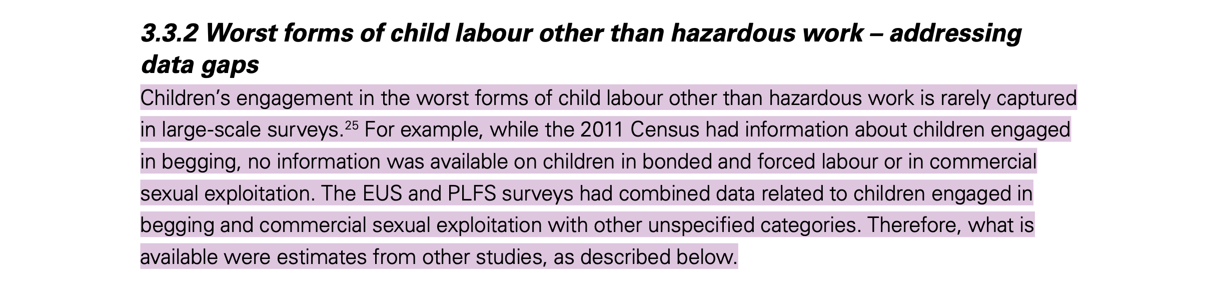
Moreover, limitations in data collection exacerbate these problems. UNICEF (2024), notes that traditional surveys often fail to cover children in the informal sector or underground economy, such as domestic work or illegal mining. Such gaps not only affect policy accuracy, but also distort or obscure public understanding, giving the impression that the problem is decreasing. In fact, the problem may simply be becoming less visible to the public. These blind spots are not new; they reflect omissions found in British factory records from the early 20th century. As was true then, so now, what is excluded from the records can be as revealing as what is included.
Reference List:
- Cigno, A. and Rosati, F.C. 2005. The economics of child labour [Online] 1st ed. Oxford University PressOxford. [Accessed 8 April 2025]. Available from: https://academic.oup.com/book/36212
- Derrida, J. and Prenowitz, E. 1995. Archive fever: A freudian impression. Diacritics. 25(2), p.9.
- Foucault, M. 2013. Archaeology of knowledge [Online] 0 ed. Routledge. [Accessed 10 March 2025]. Available from: https://www.taylorfrancis.com/books/9781135143015
- Ring, A. 2014. The (W)hole in the archive. Paragraph. 37(3), pp.387–402.
- Roberts, S.T. 2018. Digital detritus: ‘error’ and the logic of opacity in social media content moderation. First Monday.
- Thylstrup, N.B., Agostinho, D., Ring, A., D’Ignazio, C. and Veel, K. 2021. Big data as uncertain archives In: N. B. Thylstrup, D. Agostinho, A. Ring, C. D’Ignazio and K. Veel, eds. Uncertain Archives [Online]. The MIT Press, pp.1–28. [Accessed 20 February 2025]. Available from: https://direct.mit.edu/books/book/5002/chapter/2654125/Big-Data-as-Uncertain-Archives
- UNICEF Innocenti. 2024. Child labour and schooling in India: Evidence from national data. [Online]. Florence: UNICEF Office of Research – Innocenti. [Accessed 08 March 2025]. Available at: https://www.unicef.org/innocenti/media/9356/file/UNICEF-Innocenti-Child-labour-schooling-India-Report-2024.pdf
- UNICEF Innocenti. 2024. Child labour. [Online]. [Accessed 12 March 2025]. Available at: https://data.unicef.org/topic/child-protection/child-labour/
From Scrape to Story: Building Our Dataset for Analysis
In this section, we present some examples of data scraping that we used in our research. This includes attempts to extract metadata from historical documents using OCR, as well as manually scraping relevant data from contemporary child labour reports, which were then organised into CSV format for further visualisation and comparison.
First, in the preliminary data collection process, we tried to scan paper documents, digitise the text using OCR (optical character recognition) technology, and then manually classify variables such as job type, age, injury type, and employer response. Unfortunately, currently available free online OCR tools cannot accurately recognise and extract historical archival information containing handwriting. The only valid information we obtained through this method includes printed information in historical documents. The following is a screenshot of the original data collection table:
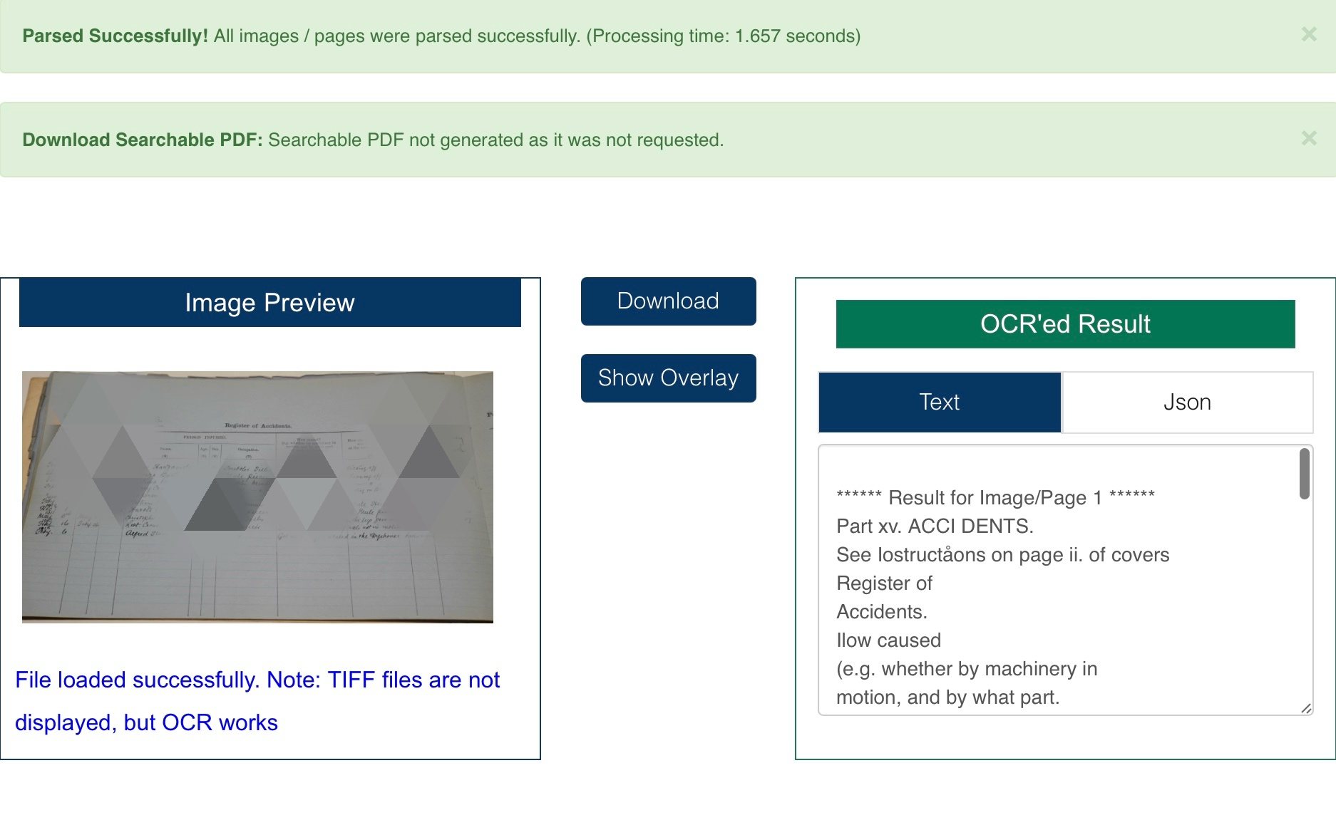
Fortunately, we did not need to extract much information from the historical archives, and with the help of our teacher, we identified and extracted the relevant content.
In terms of the collection of contemporary child labour data, we found some child labour reports on Bangladesh, India, and China that contained relevant data and manually scraped the relevant data. We then critically analysed the data in light of existing literature on the concealment of child labour and data manipulation.
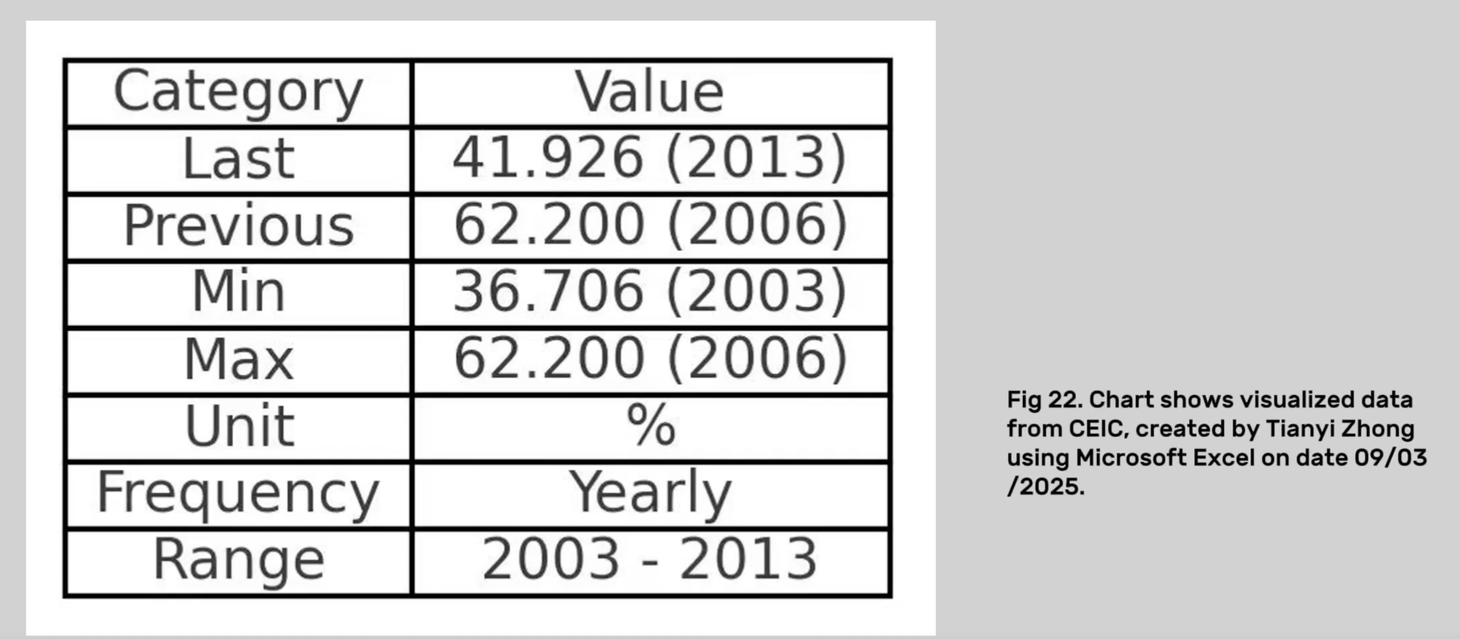
In Bangladesh, according to CEIC (2024), between 2003 and 2013, the employment rate of children aged 7–14 years experienced significant fluctuations, rising from 36.7% to 62.2%, and then falling to 41.9%. However, Human Rights Watch (HRW, 2012) pointed out that this statistic hides a more severe reality – for example, in tanneries in the Hazaribagh area of Dhaka, child workers are exposed to toxic chemicals for a long time and lack any protective measures. This shows that official data may underestimate the actual labour intensity and health risks.
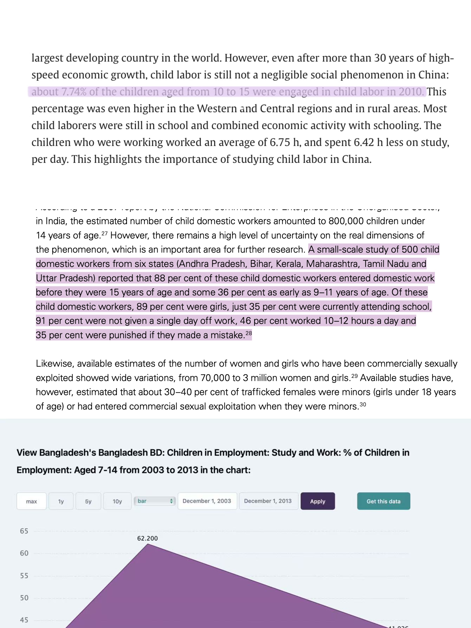
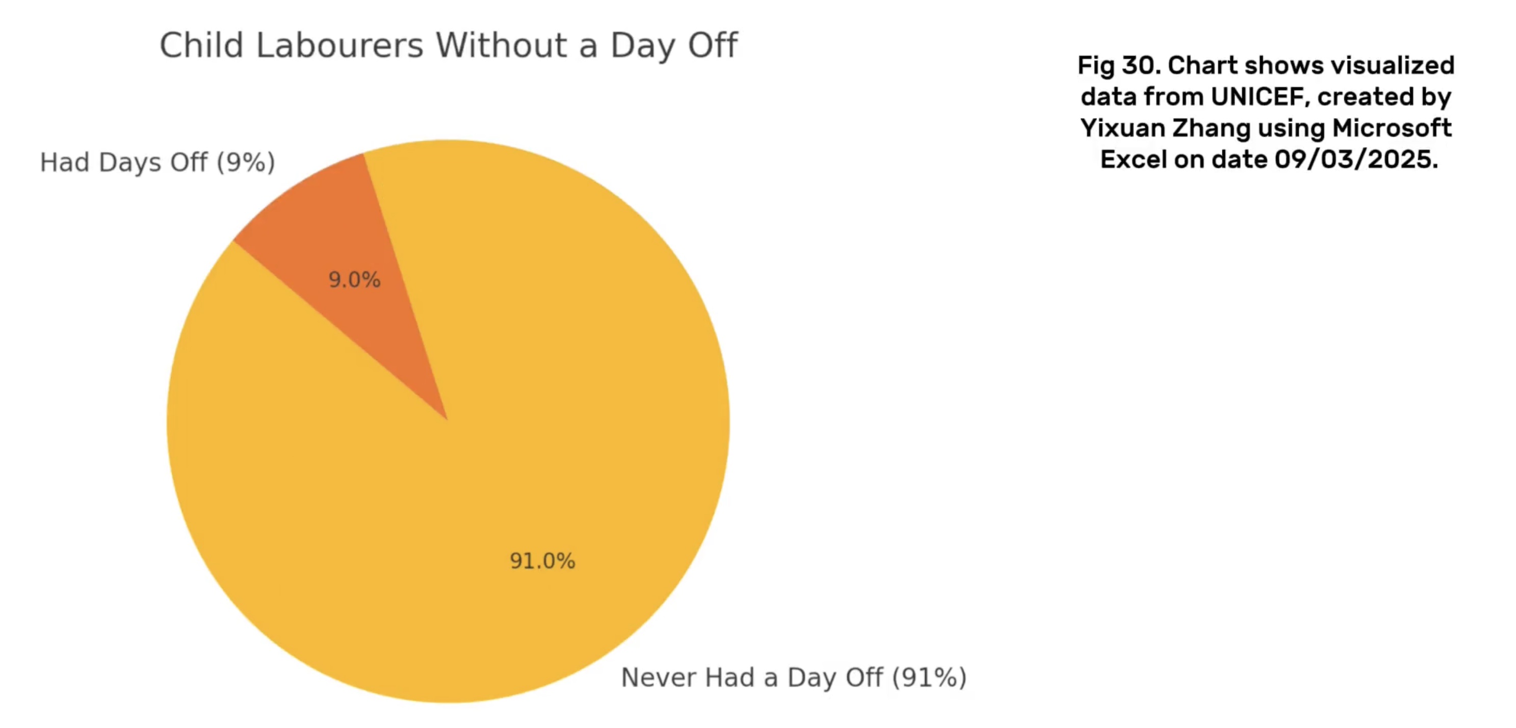
In India, although the 2011 census reported data on street-begging children, there was almost no mention of child labour related to forced labour, bonded labour, and sexual exploitation (UNICEF, 2024). A small-scale study showed that among 500 child domestic workers in six states, 88% of them entered the labour market before the age of 15, and 36% of them even started working between the ages of 9 and 11 (UNICEF, 2024). 91% of these children have never had a day off, and 46% work 10 to 12 hours a day. This extreme exploitation is not fully documented in mainstream data surveys, reflecting a huge blind spot in the data collection process.
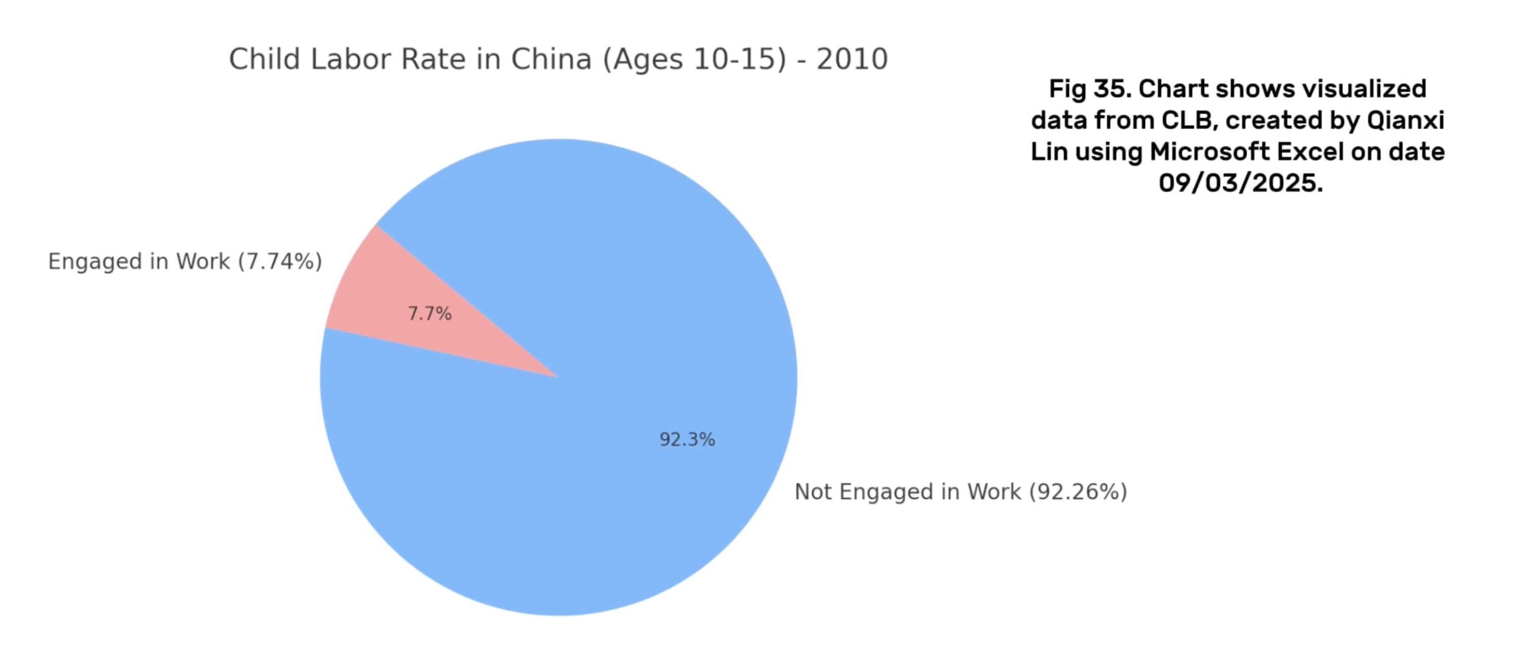
In China, despite significant macroeconomic growth, child labour still exists in rural areas. In 2010, 7.74% of children aged 10–15 participated in labour (China Labour Bulletin, 2024). However, international monitoring data still incompletely captures the phenomenon of child labour in China (UNICEF Innocenti, 2024), highlighting data gaps and statistical blind spots.
Through these cases, we analysed that although official data seem to reflect some progress, there are still many of the worst forms of child labour hidden behind them that are intentionally or unintentionally ignored. This phenomenon of partial presentation and selective disclosure is highly consistent with Roberts’ (2018) analysis that archives and digital record systems tend to “screen” and “de-metadataise”.
And, we find that past child labour problems and biases in data recording may still exist in modern society, and that data manipulation issues are more insidious, especially when it comes to the most serious forms of exploitation.
⬇️ Check & Download DatasetOur Thought And Some Charts
Directory
Others may experience this archive differently than I do due to differences in thematic focus and presentation. Although the two groups analysed the same historical archives, our group first saw the accident section in the archive and found the phenomenon of child labour and the lack of data, which shocked us very much. Therefore, we wanted to show the history through rational and intuitive data and connect it to the modern reality. The other group focused on data capitalism, including the need to reflect on the excessive collection of personal information about job applicants by contemporary HR, and discussed algorithmic oppression (such as Uber drivers losing their jobs because of scoring algorithms), which may be more relevant to the lives of their viewers. In addition, they use the form of animation to make the content more vivid. Even in the face of the same archives, the audience may have completely different understandings and feelings due to differences in focus, expression or reality relevance.
Our video includes physical media (pictures of historical archives we took in the library), AI-generated background images, and some screenshots in the section on contemporary child labour issues.
Let's first talk about the physical media we used, the historical archive itself. We took pictures of all the contents of the historical archive in the library and carefully analysed the contents to try to find the problems reflected in it. After combining the content of the literature in the reading list, we quickly discovered that there were missing or hidden data in the historical documents. The use of these physical media contents is to give readers a basic understanding of the properties of archives and data. In other words, it can help us think more critically about what is missing from the archives when thinking about the question "How can historical documents help us better understand the current situation?" Instead of being limited to the data in the archives. In addition, we also found child labour issues at the time in the historical archives, such as two-year-old children entering factories to work. This is to return to our main research question, that is, we found hidden data and child labour issues at the time in the historical archives, so we have to see if there is a data hiding problem in contemporary child labour data.
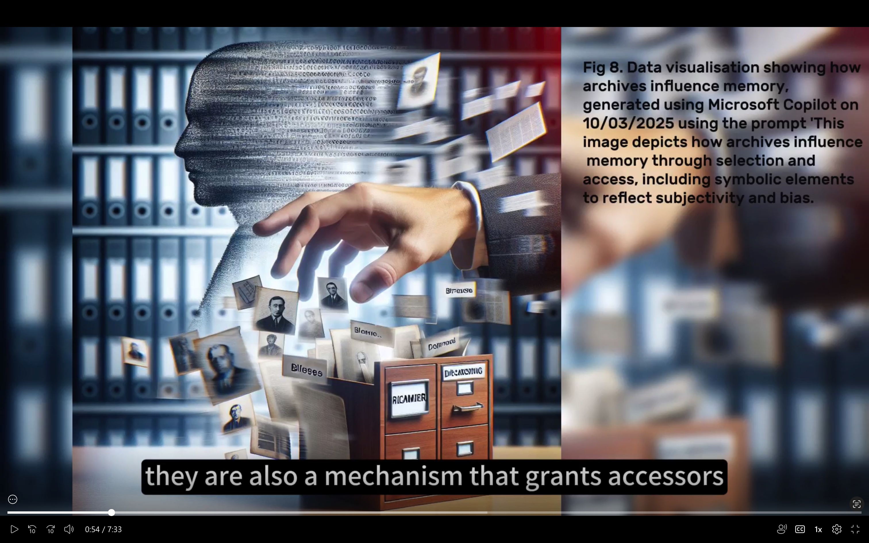
We then used two AI tools, CoPilot and ChatGPT, to generate more than 40 background images. We used AI to generate images for two reasons. First, it was difficult for us to find "appropriate" real photos because they were old and involved copyright issues. More importantly, for ethical reasons, we seemed not to be able to use photos of real child labourers at the time (although we searched for many).
Second, using AI can greatly save the time of making videos, so we gave up the idea of making animations. Because the former allows us to output more text content within the specified time. In addition, using AI to make pictures can highlight the elements we want to convey to the audience through instructions, so that the audience can focus more on specific issues instead of being distracted by other content.
However, the method of using AI tools to make pictures is not perfect, and the problems we encountered in this process will be explained separately later.
Finally, we also used screenshots in the part about the current situation of child labour. These screenshots are from videos about child labour in Bangladesh on YouTube. We were very careful to avoid the parts containing close-ups of their faces when choosing these pictures and focused on highlighting the poor working conditions of child labourers in Bangladesh and the harm they bring to children.
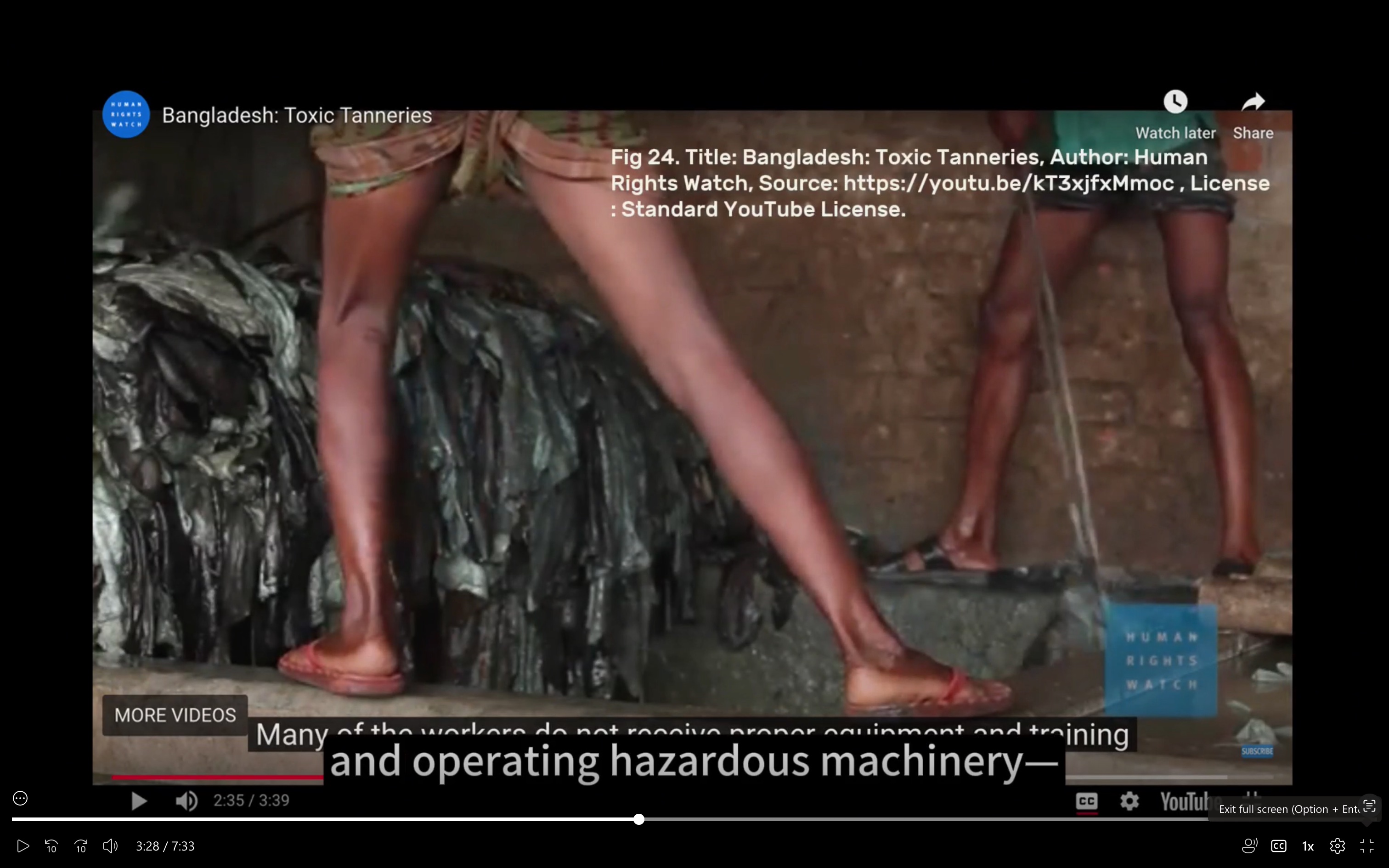
Our main purpose in using this part of the media is to alert the audience that the child labour problem still exists and to pave the way for the incomplete data on child labour in India and China in the following video. In other words, we want the audience to understand that the lack or incompleteness of child labour data reports does not mean that there is no child labour problem in reality, and it may even be hidden because it involves some extremely bad work (such as human trafficking, illegal mining, prostitution, etc.).
The use of digital media was crucial in helping us to uncover new meanings in the selected archival collections. While paper factory records from early 20th century Britain provided the initial material, it was through digital tools, visualization techniques, and narrative structures that we were able to analyse, question, and reconstruct these archives and relate them to contemporary issues.
First, digital media allowed us to visually highlight patterns of omissions in historical documents. For example, by creating graphic representations of accident record data and using background images that evoked the audience’s emotions, we were able to highlight blank fields and recurring omissions (e.g., missing information about rehabilitation, dismissal, or compensation). These omissions may be missed in a simple reading of the text, but through data mapping and image generation, they become visible, triggering analytical and emotional resonance.
Second, we used visualizations and symbolic images. By transforming abstract statistics into engaging visuals, digital media enables us to turn data into stories—making our findings more understandable, more relevant, and impactful to a wider audience.
However, in hindsight, there are some areas where we could have expanded the digital dimension further. For example:
We could have worked with digital design tools to create a more consistent visual aesthetic. And avoid information overload by more selectively curating visual content. Our peers have also pointed out that our videos may have information overload issues. In addition, we may have adopted user feedback mechanisms or real-time barrage mechanisms. That is, allowing viewers to comment on any part of the video to express their opinions or questions. This approach can deepen the dialogic nature of our video presentation, consistent with the critical interpretation emphasized by our video.
In our group video, we have analysed and reconstructed historical data and images related to child labour to gain a deeper understanding of the complexity of the issue of child labour. This is not only a historical phenomenon of the past, but also an ongoing reality in the context of globalisation today. While reviewing British factory archives, we noticed that managers often recorded only data that was favourable to themselves, ignoring or even intentionally censoring the real situation of workers. This made us realise that data is never neutral and what it reflects is often a power structure.
In the process of data visualisation, we tried to transform the original information into more communicative visual content. We redesigned the original charts, adjusted the colour scheme, structure and labels, not only for the sake of aesthetics, but also to improve the readability and efficiency of the message. We have also come to realise that visual design is not just a technical issue, but also a process of "re-expression", which affects how the audience understands and feels about a social issue.
We also used artificial intelligence tools such as ChatGPT and CoPilot to generate images and charts. This has provided us with a powerful supplement when information is lacking, but it has also created new challenges. For example, if the cues were not clear enough, the AI tended to generate images that did not match the historical context, such as overly idealised factory scenes. During this process, we have come to realise that technological tools are not neutral, and their use requires constant adjustment and judgement to maintain a high level of sensitivity to historical accuracy.
In this project, we used AI image-generation technology to recreate historical scenes, which provided new perspectives on our collection, especially in the absence of authentic visual materials. Compared to abstract data or written descriptions, visual representations made the historical context more intuitive and vivid, helping viewers to emotionally engage with and better understand the lived experiences of the time.
This process also revealed the limitations of AI-generated imagery. The accuracy of the visuals depends heavily on the clarity of the input prompts. If the descriptions are vague, the AI often produces idealised or unrealistic scenes. For example, when we failed to specify the factory setting, the system generated an image of a spotless, well-lit textile mill resembling a library, with neatly dressed workers—completely detached from historical reality.
Another aspect worth reflecting on was our use of CoPilot to generate images that complemented our narrative. This experience highlighted that while AI visuals can be highly persuasive, they may also obscure historical inaccuracies. Therefore, crafting precise prompts is essential to ensure the resulting images carry historical authenticity and analytical value. Anyway, we did our best to create the video in a short time. If there is enough time, we can use 3d models, augmented reality or other high-quality visual presentation techniques to create the video.
So, digital media expanded our expressive and methodological possibilities, allowing for richer historical representation. At the same time, it introduced new challenges. The process reminded us to approach such technologies with critical awareness, remaining vigilant about the ways they might oversimplify, beautify, or distort the past—and to always prioritise historical accuracy in the use of AI tools.
This part can be regarded as some of our reflections on feedback, namely that our videos contain a large amount of data but do not provide sufficient time for the audience to fully browse through these data. All the new data visualisations below were obtained by manually extracting metadata and organising them into CSV files, and then importing them into “Datawrapper” (a free online digital visualisation tool).
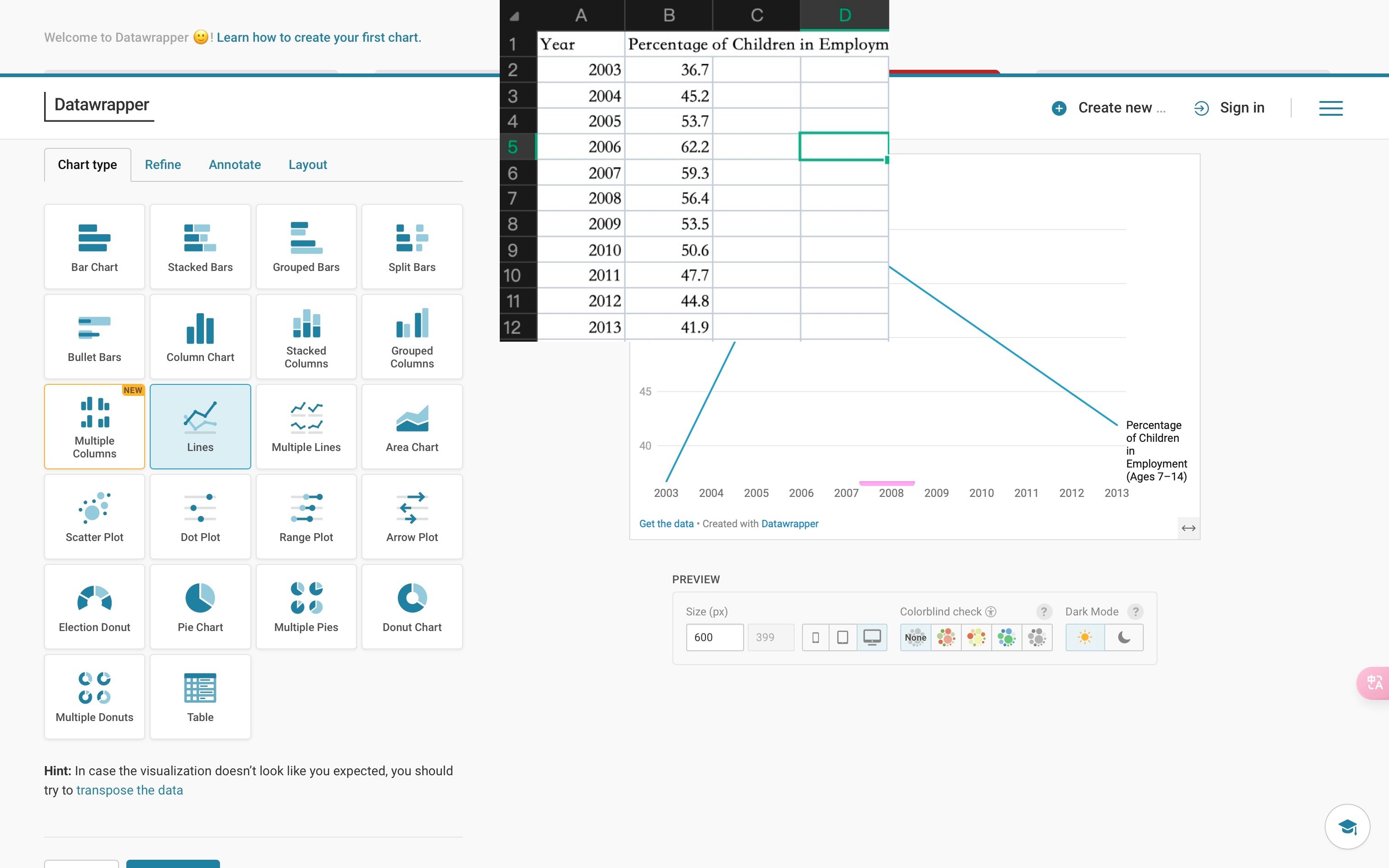
Furthermore, we have made adjustments to the presentation form of these data, aiming to enhance the viewers’ comprehension of the data content and taking into account the accessibility aspect by using more contrasting colours to highlight the contrasts among the data.
The following are four visualisations of data, along with comparisons to the previous charts.
Fig. 1
Comparison with the charts in the previous group video:
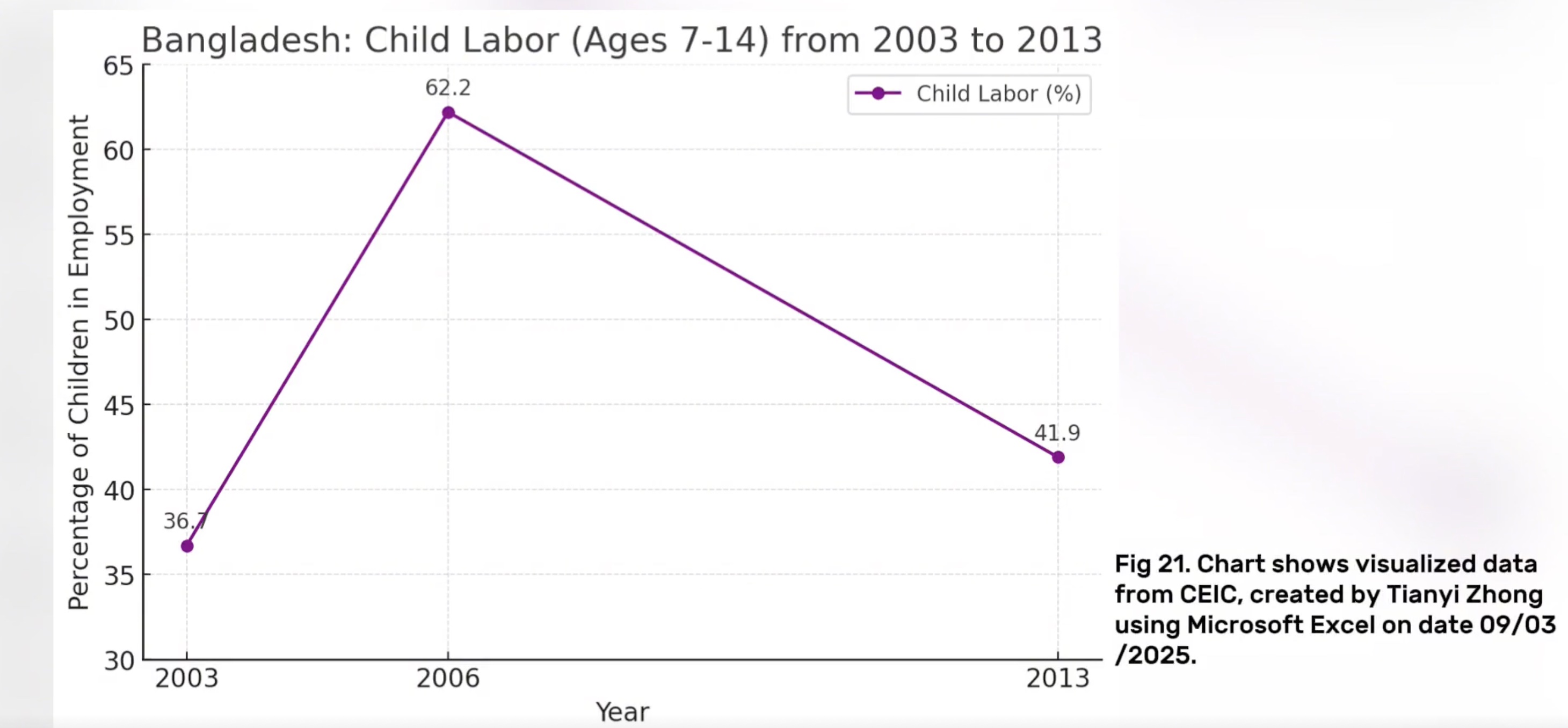
This chart has been redesigned to optimise both the visual presentation and the communication of information. The original chart used purple lines with low contrast, and the key data labels were not prominent enough, resulting in limited overall readability, especially for colour-impaired users who have greater difficulty in identifying them. The improved version uses a higher-contrast blue as the main colour to make the data trends clearer, while following the principle of colour-friendliness to enhance the inclusiveness of the chart. The fonts and labels have also been adjusted, and numerical information is directly labelled next to the data points, avoiding visual jumps in the reading process. The overall structure of the charts is more concise, and unnecessary legends and borders have been removed to keep the content focused and to the point. In addition, with the Datawrapper platform, the charts are more web-compatible and interactive, making them suitable for display in different media. Overall, the improved charts are more aesthetically pleasing, clearer, and more effective in communication.
Fig. 2
Comparison with the charts in the previous group video:
In figure 2 both charts have kept the core data is consistent. Compare with the old chart used in our video, the new pie chart using colour-blind friendly colours to create a strong contrast visualisation. Use arrows and percentages to mark directly on the chart, which avoids readers switching back and forth between legends and charts. The new chart also includes the total number of cases which enhances the completeness and credibility of the data. The overall typesetting is more concise and beautiful, given a better reading experience. Additionally, the new data visualisation adds an element of interactivity- clicking on the blue or orange segment will hide the opposite segment. This not only highlights the contrast between the data but also increases viewer engagement. Overall, the old diagram is manually made for preliminary data reporting on our video; the new figure is obviously for formal presentation, emphasising the visual quality and professionalism of the data.
Fig. 3
Comparison with the charts in the previous group video:
Compared to the chart we used in the video, this improved version enhances visual clarity, structure, and accessibility. For example, it embeds explanatory text near key data points, making the presentation clearer and reducing redundancy—helping viewers focus better. In contrast, the original chart repeated data in both the legend and labels. Additionally, the old chart's color scheme may have been difficult for some viewers to distinguish, while the updated version uses a color-blind-friendly color palette.
Fig. 4
Comparison with the charts in the previous group video:
The updated table improves data accessibility and user understanding through a clear title, structured context fields (such as age group and data source), and a built-in search function. Compared to the static Excel version, it offers enhanced readability with modern formatting and visual hierarchy. These additions reduce cognitive load, making it easier for viewers to interpret key trends.
In assessment 2, we went to see the archive we chose, filmed what we considered to be valuable content, and then through active discussion and interpretation of the archive, we reached a consensus on the material and decided what we wanted to focus on in the video. Once the preliminary work was complete, we worked together to refine the script to ensure that we could deliver what we wanted to say while retaining the contributions of our team members, and to ensure that the video reflected the decisions we had made together.
If changes can be made to the presentation of the video, perhaps we filter the original complicated data and turn it into visual charts to display. However, this would have its drawbacks, if the amount of data in the chart is too large, the audience may need some time to read and understand it, visually it would become monotonous, and if the chart lacks explanations, the audience may be confused instead. Also, after watching the videos of other groups, we may learn from the presentation of other groups, that is, to make the content more interactive, for example, to pick out specific cases from the data we collected and make them into a story, so that more humanistic cases may be able to emotionally resonate with the audience. However, this may not be able to present enough data-based content in the required time, other content may be compressed, and the video could be less persuasive and authoritative.
Response to Feedback
Feedback Directory
First, the AI voice sounds more objective and research-based than speaking in our voice. Secondly, using AI voices can increase efficiency and reduce editing time due to manual revisions. In addition, AI ensures the quality and style of the voiceover are consistent. The AI technology allows us to customise the voice with multiple languages and accents that benefit the global audience. Nevertheless, the reason we are using American English accent is because it’s free and we are no budget for extra-cost for our video. Despite that, we found that AI male voices sounded more natural than female voices. What we have learnt from past workshops is that AI as machine learning still requires large data resources. In this case, we might consider the lack of a database of female voices due to algorithmic bias or somehow AI technology is somehow limited in imitating the female voice. Finally, there are some implications of using an American accent in our videos. Because our target audience is British, the use of an American accent may draw the audience's attention to the voice rather than the content. From a cultural perspective, narrating with an American accent would allow the video to analyse and critique issues of British history from an American point of view, which may leave Britons feeling unconvinced when watching the video.
In the video, we ended up using a large number of AI-generated images as visual aids. Initially, we didn’t have as many AI-generated images, but during the formal editing, I thought of using the Copilot tool from previous workshops to help generate visual effects that match our ideas. Later, we found that many photos from sources require permission or are restricted from use. Therefore, we rely more on visual effects generated by AI, which saves us some time and allows us to better combine visual effects with video content. However, if we were to improve the video, I think we could spend more time looking for non-ai images. Images generated by artificial intelligence are often more abstract and less intuitive. If there are too many AI images, it may reduce the appeal of the video to the audience.
We received feedback from peers about the heavy use of data in our video scripts. Indeed, we recognize that the amount of data presented, especially across multiple countries and time periods, can appear overwhelming in a short visual narrative. However, this approach was intentional for two key reasons:
1. Establishing historical-contemporary continuity:
By presenting British factory records from the early 20th century and contemporary datasets from Bangladesh, India, and China, we aim to establish a strong contrast between the past and the present. This supports our core argument that the logic of data manipulation (through omissions, filtering, or underreporting) remains consistent across periods and regions despite different political or technological contexts.
2. Emphasizing structural and global patterns:
Rather than focusing on one country or case, we included multiple datasets to emphasize that child labour is not an isolated issue. It is a global, systemic problem that is influenced by economic incentives, power dynamics, and selective recording. By presenting cross-national data, we can compare differences in visibility and reporting, while also showing how countries shift the burden under globalisation.
That being said, we acknowledge that too much numerical detail may affect viewer engagement and processing power, especially in a short video. To address this, we have the following ideas:
First, integrate quantitative data into key points, perhaps using one visualization per country or region instead of citing multiple statistics. Then selectively tell the story, letting the visuals carry some of the information load (e.g., learning from other groups, using more engaging animations instead of reading full data; but doing so may make our points more than we can make in the time allotted). In addition, it may be interesting to move from raw data to illustrative cases, such as the story of "Jahaj" in Bangladesh or the case of "Ernest Gill" in the UK, which can humanize the issues and engage the audience emotionally.
Combined with peer reviews, our future goal is to balance factual density and narrative flow, ensuring that our analysis remains evidence-based while also maintaining a clear, accessible, and emotionally resonant structure for our audience. However, as mentioned above, time constraints are our biggest challenge.
The issue of fast speaking pace was indeed present in our video. The main reason lies in our attempt to cover three case studies—Bangladesh, India, and China—within a limited time frame while also incorporating a large amount of data and factual information to enhance the depth and persuasiveness of the content. However, this high-density information structure unintentionally led to an accelerated speaking pace during the presentation. While a faster pace can help create a sense of urgency and professional tone, it also reduces the accessibility and clarity of the message. This issue reflects our underdeveloped ability to balance content completeness with audience comprehension. In future projects, we aim to improve the structure of our content, make more strategic choices in material selection, and leave appropriate pauses in our delivery to better balance information density and processing efficiency.
Our archives are physical documents; there are no digital copies, and all data is recorded manually. The writing fonts in the archive are in fancy script, so this is very difficult for the existing automated data scraping. Additionally, we did not use automatic data scraping because manually recorded data may sometimes be abbreviated and change the printed format of the graphs.